Subscribers to iSPYETF’s free e-mail newsletter receive a market outlook, usually once a week. The market outlook below was sent out on January 21, 2025. If you’d like to sign up for the free e-newsletter, you may do so here (we will never share your e-mail with anyone, just as we don't accept advertising).
Accountability is an under appreciated concept on Wall Street, but rather than hiding in vagueties, the 2025 S&P 500 Forecast provides a trackable and research-backed forecast.
Yes, giving every critic a black-and-white foundation for criticism is a thankless job. But, not putting all the amazing indicators to work would be much worse.
The 2025 S&P 500 Forecast sports 29 charts and analysis based on:
- Market breadth
- Technical analysis
- Investor Sentiment
- Seasonality, Cycles and Correlation (new)
- S&P 500 Barometers
- Valuations (included a big valuation trap)
- Yield Curve
- MEGA Trends
- Risk/Reward Heat Map
- 2025 S&P 500 Projection
You can expect to see multiple studies like the one below:
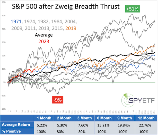
Shown are S&P 500 returns for the 12-month period following a Zweig Breadth Thrust. This particular breadth thrust happened only 10 other times.
Each graph shows the return trajectory after each individual signal. The performance tracker at the bottom reveals that 6, 9, and 12 months later, the S&P 500 was up every time. The average return after 12 month was 22.76%.
This study was published in the 2024 S&P 500 Forecast, and the S&P 500 return for the year 2024 was 23.31%.

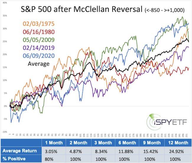
The McClellan Summation Index study (which triggered on 12/27/2023 and was also featured in the 2024 S&P 500 Forecast), projected positive returns for the coming 2, 3, 6, 9, and 12 month with an average 1-year gain of 24.92%.

Those 2 studies were a major reasons why my published 2024 year-end S&P 500 target was higher than any of the major Wall Street firms.
New Feature
The 2025 S&P 500 Forecast includes an exciting new forecasting feature. Price pattern correlations.
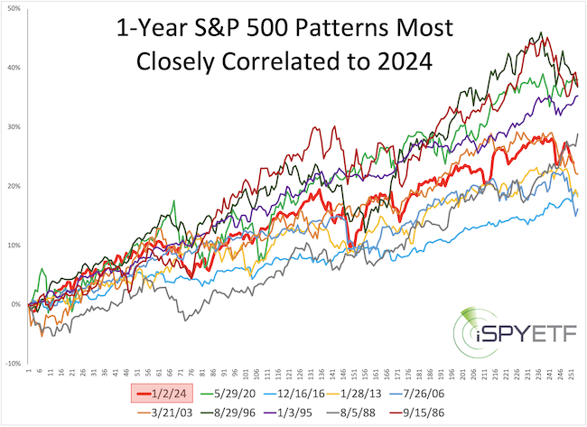
Using sophisticated programs we identify S&P 500 chart patterns that most closely correlate to that of 2024. Shown below are the most similar 1-year price patterns:

2024 certainly was unique, but there were 9 other one-year periods that had a very high correlation to the 2024 chart pattern.
The next step - identifying how the S&P 500 performed after those most similiar 1-year periods - turns this interesting exercise into actionable research.
The performance tracker and individual and average forward returns - expressed in graphs and tables - is part of the research going into the 2025 S&P 500 Forecast.
The Valuation Trap
According to the famous Shiller CAPE ratio, stocks are overvalued. In fact, Motley Fool claims that every time the CAPE ratio climbed above 30, stocks tanked thereafter (between 20% and 89%).
Sounds convincing, doesn't it?
Let's compare Motley Fool's claim with the facts:
Here is Motley Fool's exact analysis: "On Dec. 24, the S&P 500's Shiller P/E Ratio closed at 38.35, which is within striking distance of its yearly high of almost 39. Here's where things get interesting: There have been only six occurrences of the Shiller P/E surpassing 30 during a bull market rally in 154 years, including the present, and all five prior instances saw the Dow Jones Industrial Average, S&P 500, and/or Nasdaq Composite eventually lose between 20% and 89% of their value."
It sounds like CAPE readings above 30 are bearish. But, is that really true?
For starters, CAPE surpassed 30 about a dozen times, not just 6 times (due to resets by brief intervals below 30), but if we look at the 5 modern time instances Motley Fool referred to, we get the signals shown below (we excluded 1929 because - althoug timely - data was not available at the time).
The lower graph represents the CAPE ratio, with the dotted line marking the 30 level. The orange dots on the S&P 500 graph represent CAPE readings above 30. Now, notice how long it took for the S&P to turn lower following the first CAPE reading above 30.

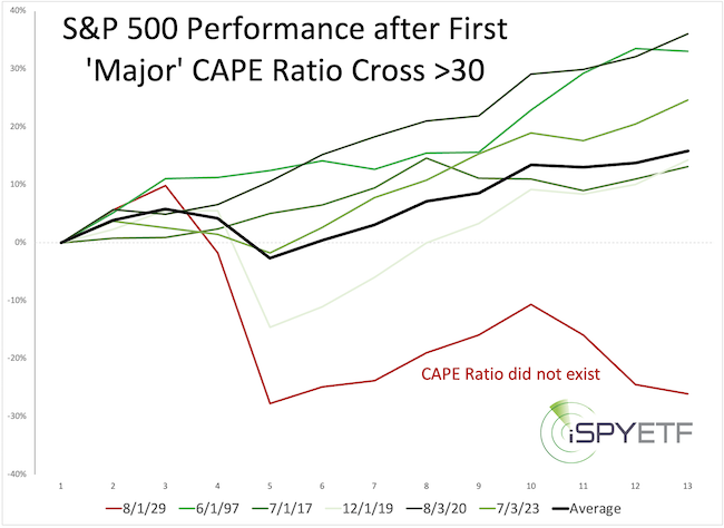
The next chart illustrated the delayed reaction even more effectively.
Shown are S&P 500 returns for the 12 month following each initial CAPE move above 30. Every time (aside from 1929), the S&P was higher 12 month after the initial 'sell' signal.

What's the lesson? Double check the so-called facts before putting your money where someone else's mouth (or writing) is.
Despite the amazing research, the 2025 S&P 500 Forecast will not be infallible. I realize it's impossible to predict the unpredictable.
However, profitable investing is about avoiding dumb mistakes and putting the odds in your favor, and the Profit Radar Report aims to do just that, while making you the best-informed investor you know.
Test drive the Profit Radar Report now and get instant access to the 2025 S&P 500 Forecast.
The Profit Radar Report comes with a 30-day money back guarantee, but fair warning: 90% of users stay on beyond 30 days.
Barron's rates iSPYETF a "trader with a good track record," and Investor's Business Daily writes "Simon says and the market is playing along."
|