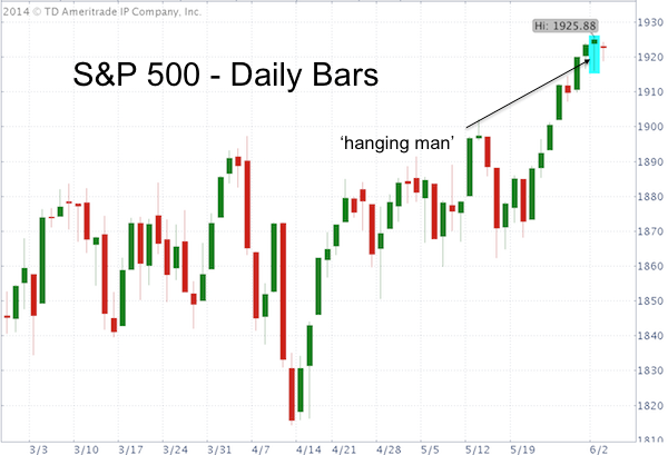
The S&P 500 (SNP: ^GSPC) closed with a ‘hanging man candle.’ What is it and what does this mean?
As the imposing title implies, the hanging man title (from now on abbreviated as HMC) is bearish. It looks exactly the same as a ‘hammer’ candle. The only difference is that hammer candles appear in a down trend, HMCs appear in an up trend.
HMC looks like a dangling hanging man, hammer or umbrella (see S&P 500 chart below). It reflects a trading day where sellers initially pushed prices lower.

Despite buyers coming in to end the session higher, it is a sign of selling pressure (it doesn’t matter if the candle body is green or red).
Martin Pring’s book on technical analysis states that: “If a hanging man appears after a prolonged upmove, it should be treated with respect.”
As with any other candle formation, the hanging man is a warning sign that requires confirmation. In itself, it should not be treated as sell signal.
A ‘deep tissue’ look at the S&P 500 (NYSEArca: SPY) confirms the rudimentary hanging man warning signal. Since its technical break out on May 23 selling pressure has been building and buying power decreasing.
This weakening is occurring just as the S&P 500 (and particularly the Dow Jones, Nasdaq Composite and Russell 2000) approach key resistance levels.
Here’s a closer look at market internals not discussed by the financial media:
Stocks Approach Potential Bullish Springboard – Is There Enough Energy to Pop Higher?
Simon Maierhofer is the publisher of the Profit Radar Report. The Profit Radar Report presents complex market analysis (S&P 500, Dow Jones, gold, silver, euro and bonds) in an easy format. Technical analysis, sentiment indicators, seasonal patterns and common sense are all wrapped up into two or more easy-to-read weekly updates. All Profit Radar Report recommendations resulted in a 59.51% net gain in 2013.
Follow Simon on Twitter @ iSPYETF or sign up for the FREE iSPYETF Newsletter to get actionable ETF trade ideas delivered for free.

|