During much of 2013, the S&P 500 followed two predictably repetitive bullish patterns:
-
Persistence below resistance leads to higher prices.
-
Quickly recovered dips below trend line support lead to higher prices.
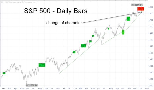
The S&P 500 (SNP: ^GSPC) chart below illustrates the bullish outcomes of both patterns with green rectangles and circles.
The red box highlights a change in character.

For much of 2014 the S&P 500 was bumping against resistance at 1,855.
In 2013 that kind of persistence around resistance would have been followed by a bullish break out. Not in 2014.
Furthermore, the S&P 500 (NYSEArca: SPY) dipped below trend line support on Friday. Unlike the October 2013 instance (green circle), where a dip below trend line was quickly reversed, the S&P 500 of 2014 continues to head south.
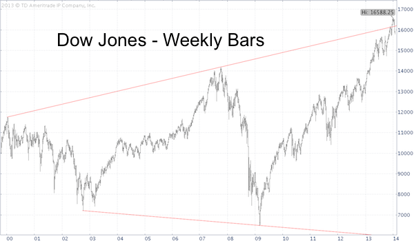
The Dow Jones even sliced below significant long-term support.
The weekly Dow Jones (DJI: ^DJI) bar chart below shows a 15-year support/resistance line.

The Profit Radar Report referred to this support/resistance line many times and warned that a drop back below it would spell trouble.
No doubt we’ll soon see a powerful bounce, but there are persuasive additional reasons why this correction will ultimately have further to go.
3 Reasons Why a Longer Correction is Likely
Simon Maierhofer is the publisher of the Profit Radar Report. The Profit Radar Report presents complex market analysis (stocks, gold, silver, euro and bonds) in an easy format. Technical analysis, sentiment indicators, seasonal patterns and common sense are all wrapped up into two or more easy-to-read weekly updates. All Profit Radar Report recommendations resulted in a 59.51% net gain in 2013.
Follow Simon on Twitter @ iSPYETF or sign up for the FREE iSPYETF Newsletter to get actionable ETF trade ideas delivered for free.

|