Guess what! The S&P 500 (SNP: ^GSPC) now trades above 1,700.
Should I dare ask, why the S&P 500 (NYSEArca: SPY) popped above 1,700? As every Grandma and kindergarten kid will tell you, it’s because of what Bernanke said on Wednesday's post FOMC address.
This may well be, there’s no denying that the Fed has fueled the stock market, but there’s another – possibly even better – explanation for the pop.
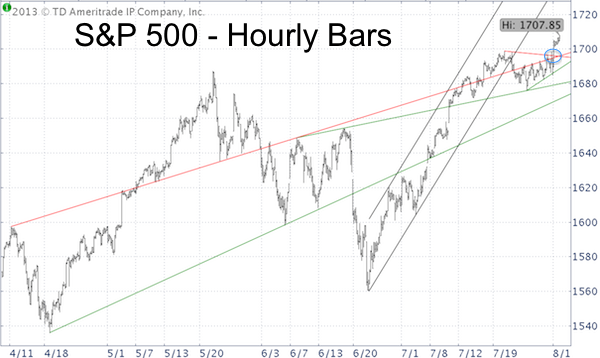
The S&P 500 chart below was initially published in the Wednesday edition of the Profit Radar Report and reveals something not commonly addressed by the mainstream media.
No, it’s not the fact that stocks didn’t pop until one trading day after Bernanke’s speech. The chart shows that price action was contained by two red trend lines that acted as resistance.

Why and how do trend lines work?
This may be a corny illustration, but resistance levels contain stocks like a fence contains a lion. If the fence is broken the lion dashes out. Like a freed lion, the S&P 500 (NYSEArca: IVV) dashed higher as soon as ‘the fence’ (double trend line) was broken.
This hourly chart evidences that short-term trend lines work quite well. Just because resistance was broken doesn’t mean a rally will continue indefinitely.
Quite often the S&P (NYSEArca: VOO) will come back down to test support (prior resistance) before moving higher or it will run into a new resistance level.
What’s the Next Target or Resistance?
To discover higher resistance levels, we need to zoom out and look at a daily or weekly chart.
The Profit Radar Report, a premier resource for S&P 500 technical analysis, has already identified the next strong resistance and target level for this rally.
It’s too early to tell for sure, but the upcoming resistance should be important as stocks run the risk of declining significantly once resistance is reached.
You may check out the Profit Radar Report or take a look at this free do-it-yourself paper on S&P 500 technical analysis.
|