The Dow Jones just got within 50 points of its 2007 all-time highs. Looking at the chart below it appears as if all the agony caused by the 2008 financial crisis has been erased.
But guess what? A chart can be deceptive. I’m not the first and probably won’t be the last to point out the painful differences between Dow 14,000 in 2007 and Dow 14,000 in 2013.
On open-eyed trip down memory lane will highlight many perverse market realities not captured by any single bar or candle chart. What are they and who profits from them?
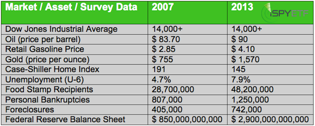
The two most recent Dow 14,000+ readings happened in February 2013 and October 2007. Let’s compare the two.

The table above speaks for itself and tells the story of millions of Americans still left without (adequate) jobs, out of their homes, bankrupt, and/or on food stamps.
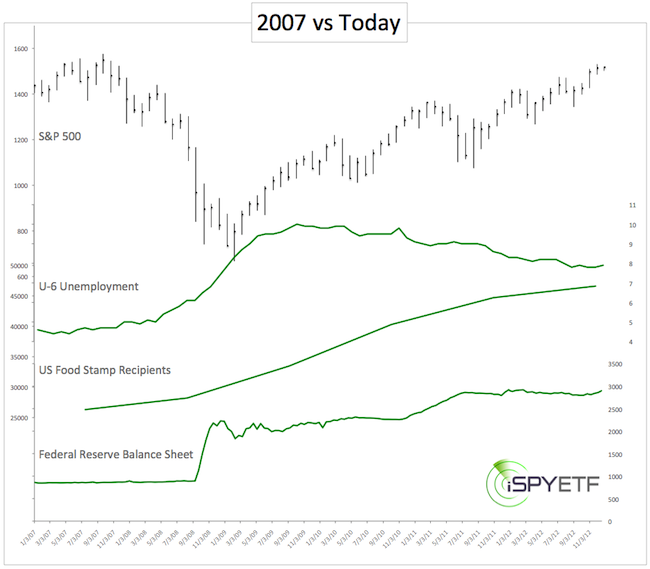
The chart below ads a few more brush strokes to that picture as it plots the S&P 500 against unemployment (the rosy U-6 number), food stamp recipients and the Fed’s balance sheet.
But there’s another story to tell. The story of the “1%-ers” or the “1% of 1%-ers.”
According to Forbes, the year 2012 saw 200 new billionaires, a 16% increase over last year. The total number of billionaires is now a record 1,426 worldwide.
As a group, billionaires’ net worth soared to 5.4 trillion, 17% year over year increase. The average net worth of a billionaire is $3.8 billion according to Forbes. It's tough to find historical data on the world's billionaires, but in 2004 there were 691 billionaires collectively worth $2.2 trillion.
Although the future of the fake QE bull market is uncertain, we already know the winners and losers of the great fake recovery: The ‘expensive champagne elite’ (winners) and ‘cheap beer economy class’ (losers).
There are now more billionaires and more welfare recipients than ever before. Whether QE and worldwide quantitative easing is to blame for this we don’t know.
Unless they find a way to profit and not get hurt by QE, the middle class will become the next ‘mammal’ on the list of endangered species.

|