The ratio of two diametrically opposed asset classes often provides insightful clues about what investors are doing.
The XLY:XLP ratio is one such example.
Unlike many hypothetical indicators, the XLY:XLP ratio is an actual money flow indicator, based on what investors are doing, not saying or thinking.
XLY represents the Consumer Discretionary Select Sector SPDR ETF. XLP represents the Consumer Staples Select Sector SPDR ETF.
The XLY:XLP has offered some excellent signals and tell tale signs both long-term and short-term.
Long-term:
A breakdown of the XLY:XLP correctly signaled the 2000 and 2007 market tops.
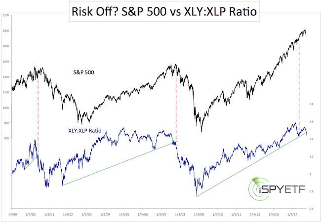
Short-term:
We looked at the XLY:XLP ratio twice this year.
The first time was on May 20 (click here for May 20 article), when it was at the verge of breaking down.
The conclusion back then was that there were simply to many bears to drive the S&P 500 down.
Complex Analysis Made Easy - Sign Up for the FREE iSPYETF E-Newsletter
The second time was on August 7 (click here for August 7 article), when the XLY:XLP ratio rose despite an S&P 500 selloff (see chart below for dates).
The conclusion was that the XLY:XLP ratio rally actually reduced the risk of an immediate stock market decline. The S&P 500 rose steadily for the next 90 days or so.
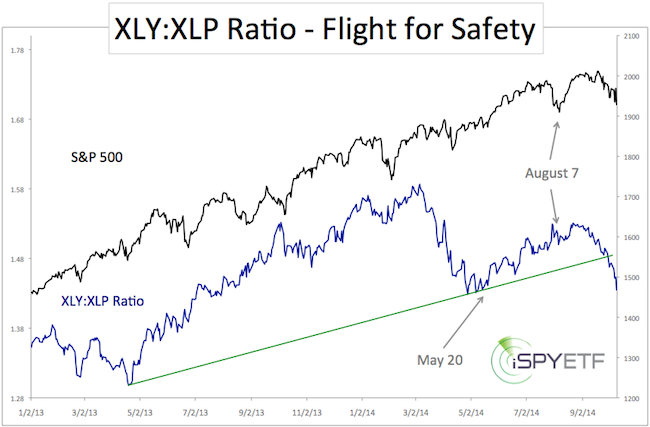
This time around the picture looks different, as the ratio has broken below long-term trend line support. This suggests that the time of shallow, V-shaped corrections – so prevalent throughout 2013 and 2014 – is over.
Another 2000 or 2007-like Top?
Does this breakdown also foreshadow another bear market, like it did in 2000 and 2007.
Context may be key here. The 2000 and 2007 market tops were also preceded by an even more important sell signal (more about this signal in a moment). This signal hasn’t triggered yet convincingly.
Furthermore, a close-up look at the XLY:XLP ratio since 2008 shows two prior trend line breaks (2012 and 2013, red circles) that turn out to be false signals. Unlike the 2001 – 2007 move, the post 2009 rally has been quite choppy, testing and breaking support more frequently.
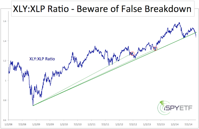
The XLY:XLP ratio by itself is telling us that there is potential for further losses, but as the 2012 and 2013 breakdown reversals show, any correction may hit rock bottom without notice.
Looking at the ‘Big Guns”
As mentioned above, another indicator that not only foreshadowed the 2000 and 2007 market tops, but also predicted that every correction since 2009 would lead to new highs, has not yet given a convincing sell signal.
The indicator is probably the most valuable gauge for any investor at this moment.
It is discussed in detail here: 3 Strike Wall Street Law – QE Bull Market Only One Strike away From Knock Out
Simon Maierhofer is the publisher of the Profit Radar Report. The Profit Radar Report presents complex market analysis (S&P 500, Dow Jones, gold, silver, euro and bonds) in an easy format. Technical analysis, sentiment indicators, seasonal patterns and common sense are all wrapped up into two or more easy-to-read weekly updates. All Profit Radar Report recommendations resulted in a 59.51% net gain in 2013.
Follow Simon on Twitter @ iSPYETF or sign up for the FREE iSPYETF Newsletter to get actionable ETF trade ideas delivered for free.
|